
![Colors[1]](https://opentutordesignschool.com/wp-content/uploads/2025/08/Colors1-1024x682-1024x585.jpg "Colors[1]")
How to Apply a Color Palette to Your Design
A color palette is one of the most powerful tools in design. Selecting the right shades is only the first step. The real magic happens when those colors are applied strategically. Good color usage creates harmony, establishes hierarchy, and strengthens brand identity. Poor application, on the other hand, can make even the best colors look messy and confusing.
This guide walks you through the essential roles of colors in design and provides a clear process for applying them effectively. By following these steps, you can create designs that are balanced, consistent, and visually appealing.
Understanding Color Roles in Design
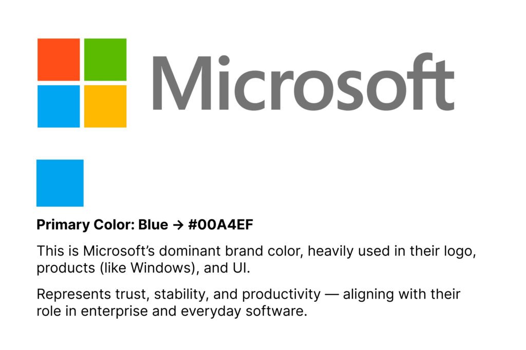
Primary Colors – The Foundation
Your primary color is the anchor of your palette. It reflects your brand personality and should be the most dominant shade in your design. Think of it as your “signature color.”
Where to use it:
- Main headers and titles
- Navigation menus
- Logo and core brand elements
- Backgrounds for key sections
Example: If your primary color is blue, it could dominate the website header and navigation bar while reinforcing brand recognition.
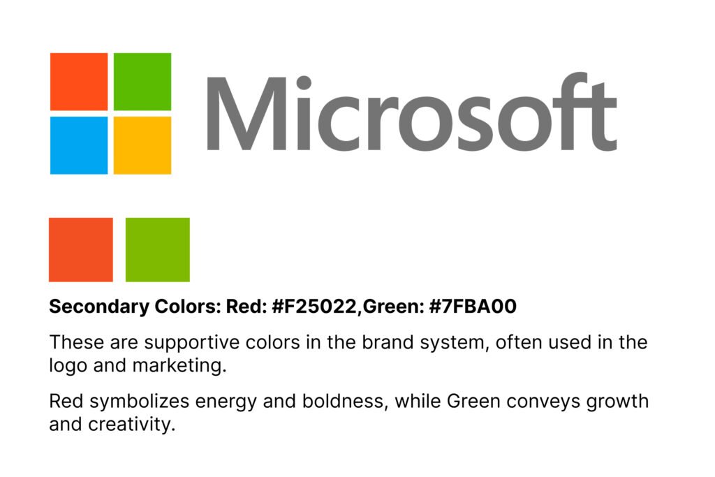
Secondary Colors – The Support System
Secondary colors exist to support the primary color. They bring variety and depth to your design without stealing attention. The role of secondary shades is to make the design feel complete while maintaining harmony.
Where to use it:
- Subheadings or secondary text
- Icons and infographics
- Supporting backgrounds
- Decorative elements
Example: A brand using blue as its primary might use light gray or teal as secondary shades for section dividers or sidebar highlights.
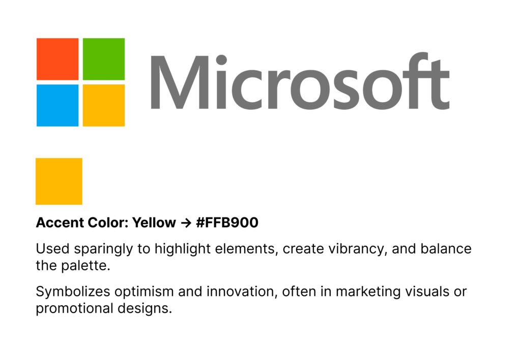
Accent Colors – The Highlights
Accent colors are your design’s attention grabbers. They direct focus, highlight key elements, and encourage action. These should be used carefully because their power lies in contrast.
Where to use it:
- Call-to-action buttons (e.g., “Buy Now,” “Sign Up”)
- Important links and icons
- Promotional banners
- Notifications or special highlights
Example: A bright orange accent against a blue-dominant design instantly stands out, guiding users toward clickable actions.
Step-by-Step Color Application Process
Step 1: Establish Hierarchy
Start by identifying which elements of your design are most important. Apply your primary color to these first. The hierarchy ensures that viewers focus on the right elements in the correct order.
Tip: Headlines, navigation, and branding usually receive the primary shade since they represent core brand presence.
Step 2: Add Supporting Elements
Once the foundation is set, bring in your secondary colors. Their role is to complement the main color while adding visual variety. Make sure they don’t overpower the primary shade.
Tip: Use them in secondary text, sidebars, or icons to create depth and balance.
Step 3: Use Accent Colors Strategically
Accent colors should be your design’s “spotlight.” Apply them sparingly to guide user attention where you want it most.
Tip: Keep accent colors to about 10% of your total palette usage. Buttons, calls-to-action, or key highlights are the best places for accents.
Step 4: Review and Refine
Once colors are applied, step back and evaluate your design. Ask yourself:
- Does the hierarchy feel clear?
- Are the key elements easy to notice?
- Are colors balanced, or is one overpowering the others?
Refine your application until the design looks cohesive and the flow feels natural.
Conclusion
Applying a color palette is about more than just choosing shades you like. It requires structure, hierarchy, and restraint. By defining clear roles for your primary, secondary, and accent colors, you can bring order to your design. Following a step-by-step process ensures consistency, improves user experience, and strengthens your brand identity.
A well-applied palette turns ordinary designs into professional, polished visuals. With practice, you’ll start to see how each color works together to tell a visual story that captures attention and leaves a lasting impression.


")

