Unlocking Vibrant Web Design: A Deep Dive into OKLCH Colors
What are OKLCH Colors?
The Advantages of OKLCH Colors for Web Design
1. Perceptually Uniformity: A Game Changer
2. Consistent Brightness Across Hues
3. Predictable Shades and Tints

A color palette is one of the most powerful tools in design. Selecting the right shades is only the first step. The real magic happens when those colors are applied strategically. Good color usage creates harmony, establishes hierarchy, and strengthens brand identity. Poor application, on the other hand, can make even the best colors look messy and confusing.
This guide walks you through the essential roles of colors in design and provides a clear process for applying them effectively. By following these steps, you can create designs that are balanced, consistent, and visually appealing.
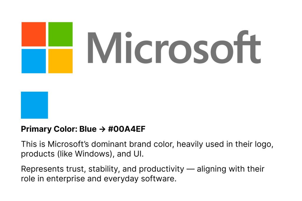
Your primary color is the anchor of your palette. It reflects your brand personality and should be the most dominant shade in your design. Think of it as your “signature color.”
Where to use it:
Example: If your primary color is blue, it could dominate the website header and navigation bar while reinforcing brand recognition.
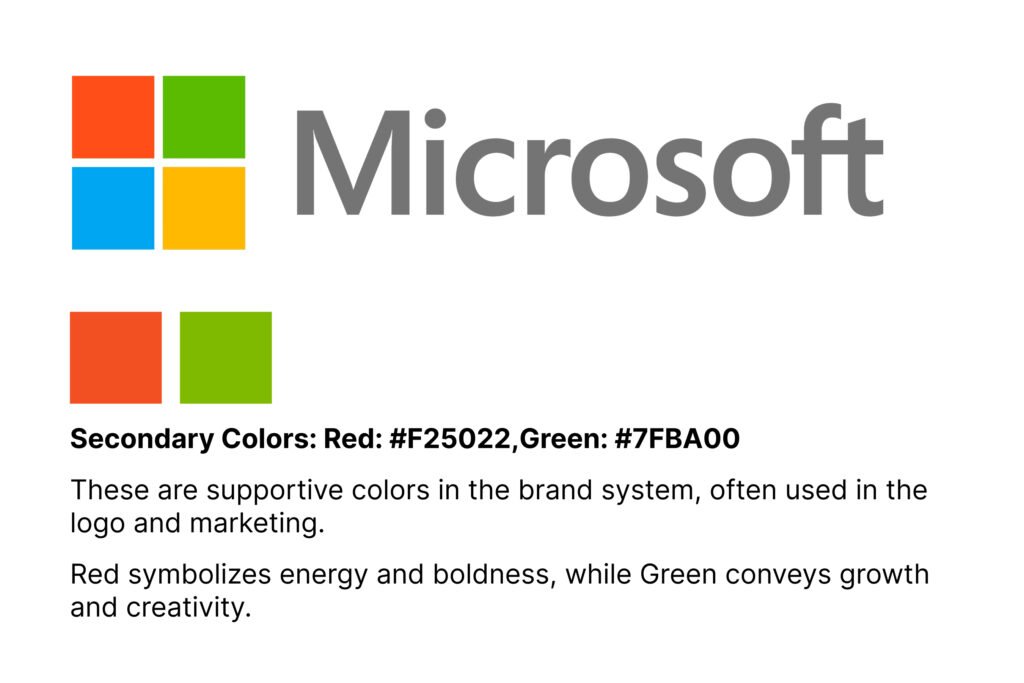
Secondary colors exist to support the primary color. They bring variety and depth to your design without stealing attention. The role of secondary shades is to make the design feel complete while maintaining harmony.
Where to use it:
Example: A brand using blue as its primary might use light gray or teal as secondary shades for section dividers or sidebar highlights.
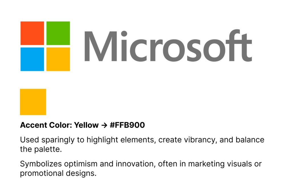
Accent colors are your design’s attention grabbers. They direct focus, highlight key elements, and encourage action. These should be used carefully because their power lies in contrast.
Where to use it:
Example: A bright orange accent against a blue-dominant design instantly stands out, guiding users toward clickable actions.
Start by identifying which elements of your design are most important. Apply your primary color to these first. The hierarchy ensures that viewers focus on the right elements in the correct order.
Tip: Headlines, navigation, and branding usually receive the primary shade since they represent core brand presence.
Once the foundation is set, bring in your secondary colors. Their role is to complement the main color while adding visual variety. Make sure they don’t overpower the primary shade.
Tip: Use them in secondary text, sidebars, or icons to create depth and balance.
Accent colors should be your design’s “spotlight.” Apply them sparingly to guide user attention where you want it most.
Tip: Keep accent colors to about 10% of your total palette usage. Buttons, calls-to-action, or key highlights are the best places for accents.
Once colors are applied, step back and evaluate your design. Ask yourself:
Refine your application until the design looks cohesive and the flow feels natural.
Applying a color palette is about more than just choosing shades you like. It requires structure, hierarchy, and restraint. By defining clear roles for your primary, secondary, and accent colors, you can bring order to your design. Following a step-by-step process ensures consistency, improves user experience, and strengthens your brand identity.
A well-applied palette turns ordinary designs into professional, polished visuals. With practice, you’ll start to see how each color works together to tell a visual story that captures attention and leaves a lasting impression.
What if you could create hundreds of beautiful, professional colour palettes using just one single colour? Greg Gunn from The Futur Academy reveals a game-changing technique that transforms how designers approach colour selection. This innovative method eliminates the guesswork from colour theory and gives you endless creative possibilities.
Most designers struggle with color selection. You might start by googling color theory, diving into Wikipedia rabbit holes, or using palette generators like Adobe Color. But what happens when you want something unique or need to customize existing palettes? That’s where this revolutionary single-color technique comes in.
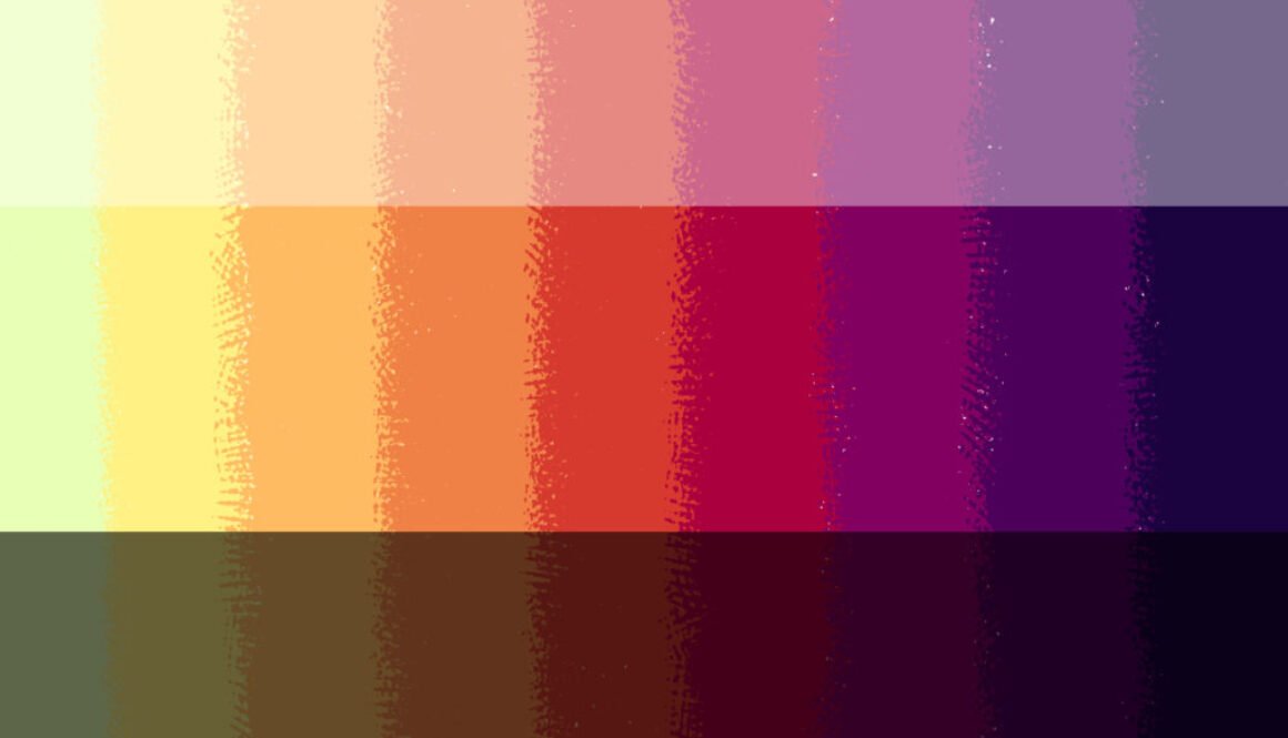
Start with a color that’s not too saturated and not too dark – you need wiggle room to work with. Greg calls his example color “Rusty” (because naming colors makes the process more personal and memorable). The key is selecting something in the middle range of saturation and brightness.
Here’s where the magic happens. Imagine a curved line starting from the top-left corner of the Photoshop color picker, bending down to the bottom-right, passing directly through your chosen color. This arc becomes your roadmap:
For Lighter Variations:
For Darker Variations:
With your expanded color family, you can now create multiple palette combinations:
For even more variations, try this advanced trick:
This technique can generate entirely different color families from the same base palette, multiplying your options exponentially.
This technique is brilliant because it:
Greg Gunn’s single-color palette technique revolutionizes how we approach color in design. Instead of struggling with complex color theory or settling for generic palette generators, you now have a systematic method to create unlimited, harmonious color combinations from just one starting point.
Remember, this isn’t a replacement for learning proper color theory, but it’s an incredibly powerful tool that can jumpstart your color confidence and creativity. The beauty lies in its simplicity and the professional results it consistently delivers.
Typography is arguably the most vital piece of the puzzle in visual communication. Imagine this: someone lands on your website. What’s the first thing they’ll likely do? They’ll look for text—to understand, to engage, and to decide whether to stay or leave. Your typography is their guide, and like any great guide, it needs to be clear, inviting, and memorable.
Let’s dive into how you can make your typography work harder (and smarter) for you.
Think of typography as the art and science of text arrangement. It’s not just about picking a font—it’s about how that font works with size, spacing, and alignment to create a design that feels right. Whether it’s a website, a poster, or even an Instagram Story, good typography enhances readability and conveys emotion.
But here’s the real magic: typography doesn’t just show the message—it is the message. The way your text looks says just as much as the words themselves.
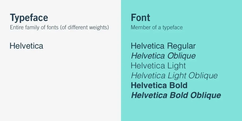
Let’s settle this once and for all:
It’s like saying, “I love ice cream” (typeface) versus “I love chocolate chip mint in a waffle cone” (font).
Each typeface has its personality, and knowing them helps you pick the right one for your project.
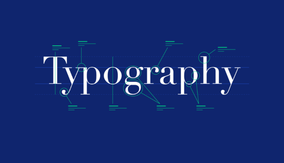
Ever noticed those little strokes at the edges of letters? That’s a serif.
Sans (French for “without”) serif fonts ditch the extra strokes for a cleaner, modern look.
These are the divas of typography—flashy and made to stand out.
Just like a house needs a solid foundation, great typography relies on its key elements.
Ever felt like text is too cramped or too spaced out? That’s leading at work. The right leading ensures the text feels easy to read and visually balanced.
Tracking adjusts the space across a whole word or paragraph. Want your text to feel airy? Increase the tracking. Want it to feel compact? Reduce it.
Kerning is more intimate—it’s about the space between individual letters. For example, in “W A”, proper kerning makes sure they aren’t awkwardly far apart.
Where does your text sit? Left, center, or right? Or maybe it’s justified (aligned evenly on both sides). Each alignment tells its own story, so choose wisely.
Here’s where you control what grabs attention first. Headlines are big and bold; body text is smaller and simpler. This structure ensures your readers don’t get lost.
Hierarchy is your design GPS—it guides readers to what matters most. Here’s how to nail it:
Here’s a quick challenge:
If you answered “no” to any of these, it’s time to tweak!
Typography is more than design—it’s an experience. When done right, it grabs attention, tells a story, and keeps readers hooked. So the next time you’re designing, remember: the right typeface, with the right elements, can make all the difference.
Ready to level up your typography game? Start experimenting and watch your designs transform!
Graphic design is all about using images, colors, and text to tell stories, share ideas, and create lasting impressions. At opentutor design school, our Graphic Design program helps students unlock their creative potential and learn the skills to make an impact in today’s visually driven world. Whether you’re interested in creating logos, posters, digital illustrations, or social media graphics, our course gives you the foundation to build a strong career in design.
Graphic design is everywhere—in advertising, magazines, websites, packaging, and more. Graphic designers play a key role in creating visuals that communicate effectively and attract attention. A career in graphic design allows you to work in various industries, like marketing, entertainment, publishing, and beyond. With the right skills, you can make a name for yourself by crafting unique visuals that stand out.
Our course starts with the basics: understanding colour, choosing the right fonts, and arranging elements to make designs look clean and professional. As you grow your skills, you’ll work hands-on with popular design software like Adobe Photoshop, Illustrator, and InDesign. Professionals worldwide use these tools to create everything from digital ads to eye-catching posters.
You’ll also explore modern design trends and learn about digital topics like user-friendly (UI/UX) design and motion graphics. With these skills, you’ll be able to create designs that are not only visually appealing but also suited to the latest industry needs.
We believe in practical, hands-on learning. Our experienced teachers are here to guide and support you, sharing tips from their own work in the industry. You’ll get to work on projects, receive feedback, and build a portfolio showcasing your unique style and skills.
If you’re ready to dive into graphic design, we’re here to help you every step of the way. Join us and learn how to turn your ideas into visual masterpieces. With a strong portfolio and practical experience, you’ll be prepared for an exciting career in the creative industry.
At Design School by Opentutor, our Integrated Design Course covers Graphic Design, Web Design, and UI/UX Design. Featuring hands-on projects, expert instruction, and career support, this program is perfect for aspiring and professional designers. Join us in Kannur to elevate your skills and advance in the exciting design world!