

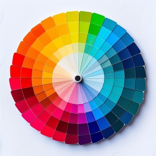
Create Hundreds of Color Palettes from Just One Color
What if you could create hundreds of beautiful, professional colour palettes using just one single colour? Greg Gunn from The Futur Academy reveals a game-changing technique that transforms how designers approach colour selection. This innovative method eliminates the guesswork from colour theory and gives you endless creative possibilities.
The Problem with Traditional Color Selection
Most designers struggle with color selection. You might start by googling color theory, diving into Wikipedia rabbit holes, or using palette generators like Adobe Color. But what happens when you want something unique or need to customize existing palettes? That’s where this revolutionary single-color technique comes in.
The Revolutionary Single-Color Method
Step 1: Choose Your Foundation Color
Start with a color that’s not too saturated and not too dark – you need wiggle room to work with. Greg calls his example color “Rusty” (because naming colors makes the process more personal and memorable). The key is selecting something in the middle range of saturation and brightness.
Step 2: Visualize the Photoshop Color Picker Arc
Here’s where the magic happens. Imagine a curved line starting from the top-left corner of the Photoshop color picker, bending down to the bottom-right, passing directly through your chosen color. This arc becomes your roadmap:
- Brighter colors = Less saturation
- Darker colors = More saturation
Step 3: Create Your Color Family
For Lighter Variations:
- Move up and left along the arc
- Decrease saturation while increasing brightness
- Crucial twist: Slightly shift the hue as you move (toward orange/yellow territory)
- Create at least 4 lighter variations
For Darker Variations:
- Move down and right along the arc
- Increase saturation while decreasing brightness
- Key difference: Shift the hue in the opposite direction (toward purple/blue territory)
- Create at least 4 darker variations
Advanced Techniques: Adding Value Layers
Creating Pastel Variations
- Select your lighter colors
- Open Hue/Saturation adjustment
- Increase lightness significantly
- Decrease saturation for pastel territory
- Slightly adjust hue toward the left
Creating Rich, Deep Variations
- Select your darker colors
- Make them even darker (but not pure black)
- Add more saturation
- Adjust hue in the opposite direction from pastels
Building Professional Color Palettes
With your expanded color family, you can now create multiple palette combinations:
Complementary Palette
- Your original “rusty” color
- A complementary green
- A neutral tone
- A deep contrast color
Soft, Low-Contrast Palette
- Muted yellow variation
- Soft green
- Warm brown
- Keep it gentle without harsh contrasts
High-Contrast Drama
- Deep purple from your dark variations
- Bright yellow-orange from your light variations
- Bright neutral
- Additional flavor accent
The Bonus Overlay Technique
For even more variations, try this advanced trick:
- Create a new solid color layer
- Choose a bright, saturated color
- Set blending mode to “Overlay”
- Watch your entire palette transform into something completely new
This technique can generate entirely different color families from the same base palette, multiplying your options exponentially.
Key Takeaways
- Start with one moderately saturated, mid-tone color
- Follow the arc principle: lighter = less saturated, darker = more saturated
- Always shift hue as you move along the arc for more interesting variations
- Create multiple value layers (pastels and deep tones) for maximum flexibility
- Combine colors thoughtfully, considering contrast and harmony
- Use the overlay technique for bonus palette variations
- Name your colors to make the process more personal and memorable
Why This Method Works
This technique is brilliant because it:
- Ensures color harmony (all colors share the same foundation)
- Provides systematic variety without chaos
- Creates natural-looking color relationships
- Gives you enough options to suit any project
- Eliminates the overwhelm of starting from scratch
Conclusion
Greg Gunn’s single-color palette technique revolutionizes how we approach color in design. Instead of struggling with complex color theory or settling for generic palette generators, you now have a systematic method to create unlimited, harmonious color combinations from just one starting point.
Remember, this isn’t a replacement for learning proper color theory, but it’s an incredibly powerful tool that can jumpstart your color confidence and creativity. The beauty lies in its simplicity and the professional results it consistently delivers.


")

![Colors[1]](https://opentutordesignschool.com/wp-content/uploads/2025/08/Colors1-1024x682-394x330.jpg "Colors[1]")